Design a logo
The task
We are using a ticket system we call TicSys, with our customers, that I developed years ago. Last week my boss asked me if I could create a logo for the system. I thought that we already had a logo. But it was basically a text and a font, noting special. So I set out to create the perfect logo for our system.

Design process
Since I have spent the last two years on moocs and reading books about design, I was exited to see what I could create. In this blog post I will tell you about the entire process. The first thing you should no is that there actually is a specific process that you should apply in all of your design projects. Regardless if it is a logo, a web page, a table or a service you are designing. Event though there are some different versions of this process depending on the project, the basic structure is the double diamond. There are other processes as well that designers use, but the basic idea is the same. You have a creative process where you create a list of ideas and suggestions, then you do a selection and decide to continue to work on the best ideas. Then you try to explore what you can do with those ideas and finally you diverge on what you think is the best path for what you want to achieve. It is also good to be in a team when you do this and there are some dynamics you can use in a team to get even greater results, but this time I did the project more or less on my own.
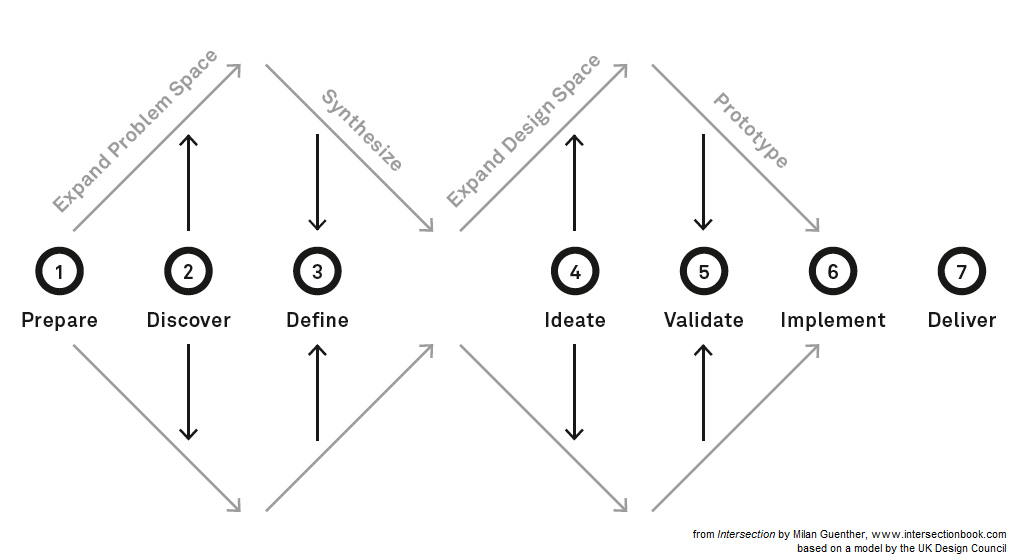
Brainstorm (Expand Problem Space)
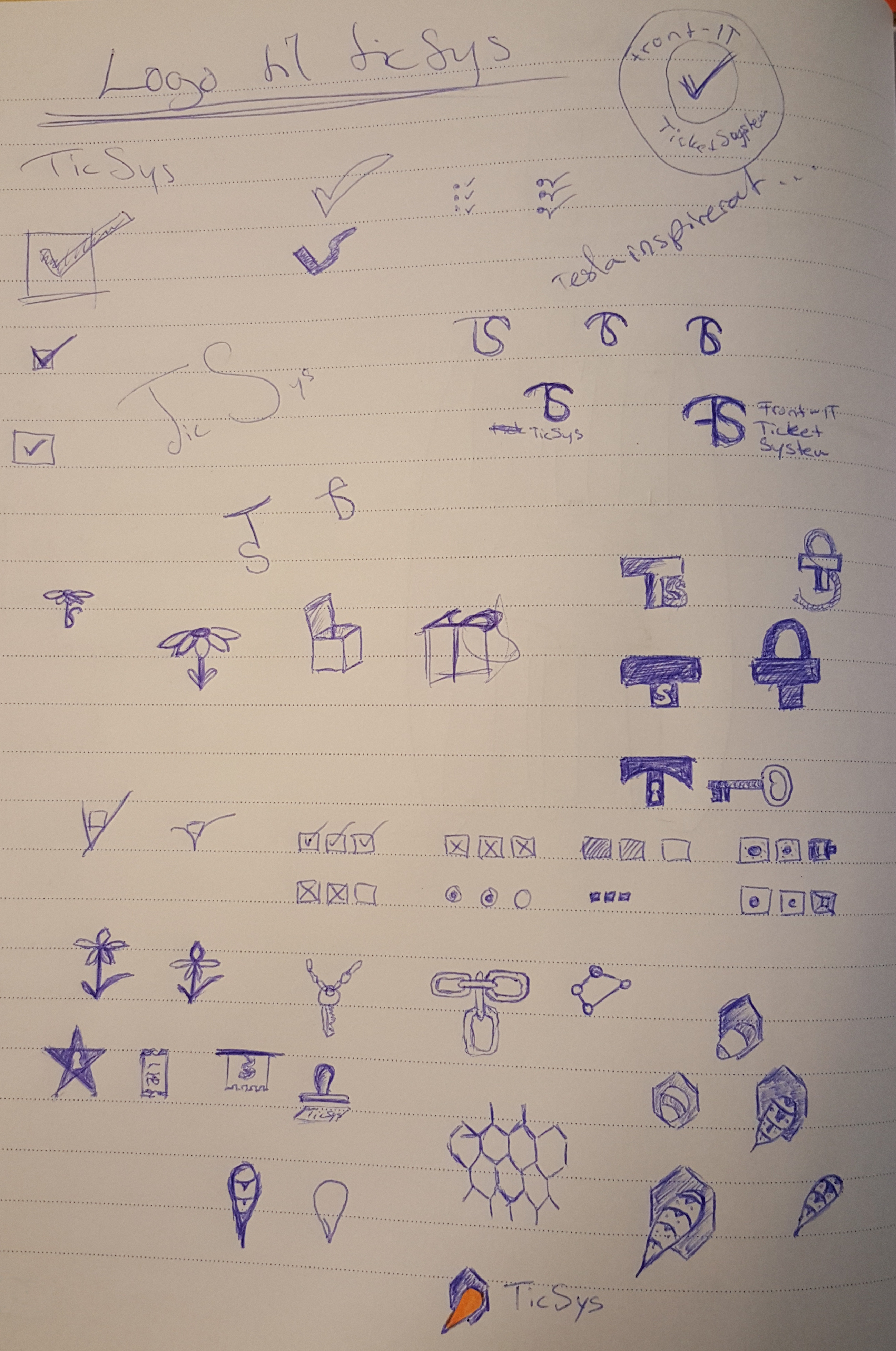
First of all I started drawing everything that popped up in my head that could possibly work as a logo. And by that trying to find as many possible ways to create a logo as I could. There where all sorts of check boxes and combinations of letters, more combinations of boxes. I spent about 1 to 2 hours per day for 3 days trying to put every idea I could get on to a paper. I thought about check boxes because they are a natural part of a ticket system, you check of tasks, and the letters were tempting to user because my graphical skills on the computer has been a bit limited. I'm not famous for doing great graphical designs by any means. Then a thought popped into my head. Isn't there an animal that I could use that get things done. Like smart as a fox, strong as a bear, or something. Then I came to think of bees, they work hard and in so doing they get things done. So if I use a bee in a honey cell then it could represent a check in the check box. So I did a few drafts on that as well.
Take a look at my first sheet of paper below to see all the ideas I came up with during this process.
Selection (Synthesize)
Now I have a list of options to work with. Two of the ideas appeal to me, so I continue to work with those to see which one would work best. The first one is the letter combination logo with a combination of the letters F, T and S (Front-IT Ticket System). The second is the bee in the cell.
Create samples (Expand Design Space)
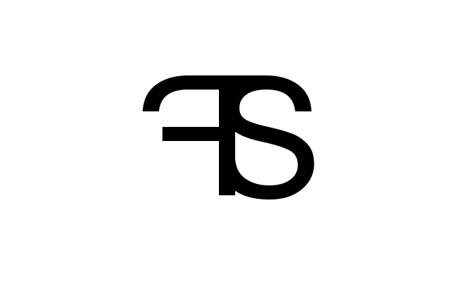
The letter combination was kind of simple to do, just find a font that matched my requirements for the idea and put each letter on a layer in an image and then cut out the pieces I did not want. Using the design of the font to my advantage I thought the logo was quite nice and it was easy to put together in my only graphical design tool GIMP.
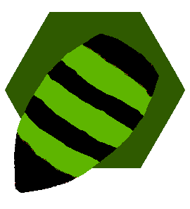
The bee logo was not as simple to create in GIMP, so I went for a very simplistic representation of the bee in the cell. Basically a combination of two shapes. A hexagon and a drop.

Now this logo does even worse in black and white. So it really needed some work, but with an explanation of the representation and a peak in my draft sketch the idea came across and my bosses wanted me to continue exploring on the bee logo.
Final touch (Prototype)
I needed to do the bee logo a bit more realistic so that you would recognize that it actually was a bee and not a yellow drop of oil or something. I was also asked to do it in green because the company logo is in green and we want to use the same colors in our products. So I started drawing as best I could, but soon realized that I must be using the wrong tool for this.
As you could see the idea was clear but the graphics still needed a lot of improvements. So I installed InkScape and starter playing around with that, and quickly came up with a series of improvements and variations of the logo.

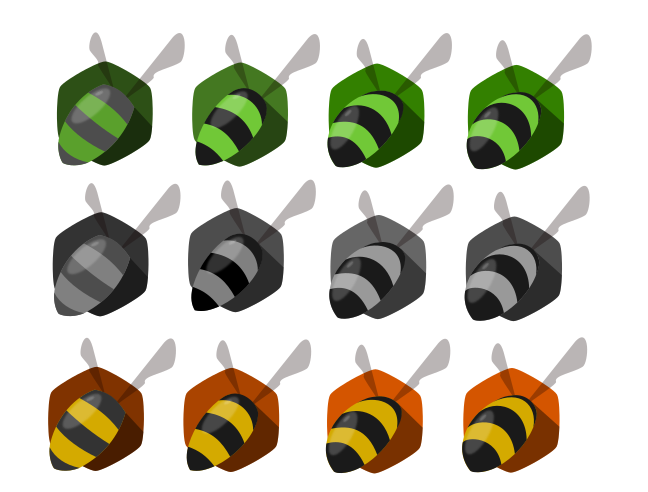
I realized that I had made the cell in a pentagon shape so first I needed to correct that mistake. Bees also have wings, so in order to make it even clearer what the rounded striped thing was I tried to add some wings, I also realized that using black instead of grey on the stripes was more aesthetic and gave me the option of using a brighter color as background. Then I showed it to my wife and she wanted the bee to be further in to the cell. So then I had to reshape the entire bee and make it look like it was further into the cell.
Delivery
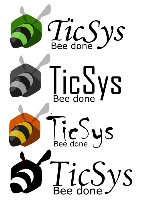
Finally I created a showcase with some different fonts. There might actually be another font all together since we are looking at changing the font of our company logo as well and we have a separate design firm looking into that. I also came up with a funny slogan, "Bee done", that reinforces the goal of the system. It is also important that the logo works in black and white so that is why I also added that as a sample.
Conclution
1. Always start with pen and paper and get as many ideas out as you can come up with. Let this part take time and do not settle with the first good idea you get. If I would have done that, I would have had a 3 letter logo. Not all that bad but I think the bee is better. If I had waited longer before the Synthesize phase I might have come up with even more good ideas. But I think that if you got two or three ideas that you like you are probably not going to get that much more great ideas by your self. Then you need a team to bounce ideas of. And I also did not want to spend too much time on this project since I have a lot of other things to do as well.
2. Use the right tools. If some part of your design process is not as smooth as you want, then consider looking for tools that other designers use when doing the type of work you are about do do.
3. Finally make sure that your logo works well in black and white and put some additional thought into the habitat of the logo. What colors work best, is their a nice slogan that could fit. Give the logo a story to go with it.
All in all I spent about 10 hours on this project so far. The next step is to redesign the entire ticket system in order for it to be worth of such a nice logo.
- Design, Logo