Nordaxon logo project
The specification
In January 2018 Melina contacted me for a logo to her knew business Nordaxon. The instructions were... No demands, but it should breathe northern lights, axon (eg. neuron nerve fiber) and AI/ML/tech, environment, nature, and simplicity. It would also be nice if it was a sort of circular logo. Preferred colors yellow, orange and black.
Nord as in northern, simple, clean, nature, northern lights and Axon as in neural, machine learning, connections, strong bonds.
So much for no demands. Usually I want to look at the target audience of the business and get a better feel for the owner and business, but in this case I new Melina since before and I kind of had a feeling for the audience she was going for so I had a pretty clear image in my head.
The initial draft
Usually I start to draw on paper in black and white, but this time the description contained color preferences and the aim was to keep the project small and not to explore to much. So, I created my first draft on the computer in color right away.
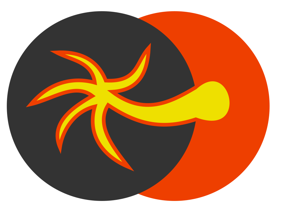
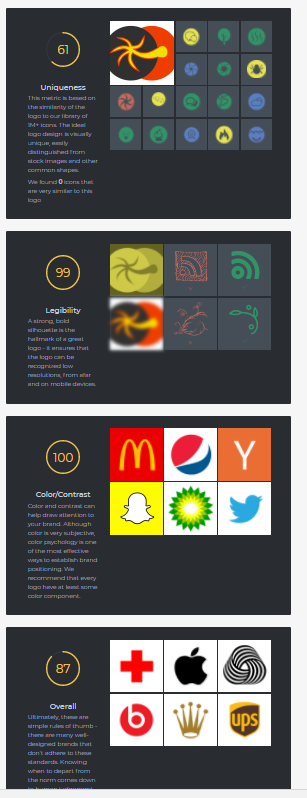
I admit after looking at it for a while it looks more like Jamaican sun trying to steal the moon with it´s palm tree arm. Melina was positive to the over all idea. Since we work in the world of machine learning I also found a tool that evaluate logos (http://brandmark.io/logo-rank) and checked the logo there and got the score 87 of 100. Not bad for a first draft.
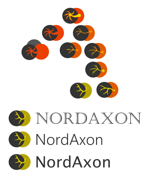
Back to the process. Instead of a palm tree I got the idea to shape the axon as the horns of a reindeer. I also turned down the orange and settled for two shades of yellow and a dark grey. Below you can see some different paths I explored and in the bottom two at the right I added the silhouette of two reindeer horns I found on google. I also explored some different fonts that I thought would go well with the business goals of the company.
My favourite was the yellow one, but it was still not as clean as I would like, I also tried to create the palm tree logo in yellow to see where that would lead.

I liked the layout of the horn and the clean feeling of the palm tree. So, I reshaped the palm to resemble the horn instead. This gave me more freedom to manipulate the shape and it turned out to be quite good. I also created a black and white version just to better see if we were on the right track. A logo should have a black and white version as well so that it works well if you do not have that many color in the print.


Now this logo still has some issues. Since at least some of the customers will be from the financial sector the placement of the circles could give associations to the MasterCard logo and the horn still lacked balance and it felt like the horn was just lying on top of the two circles.
Deciding on font
I asked Melina to pick a list of fonts from google fonts that she liked just to get a feel for what she liked, and she returned with this list. She had a hard time deciding.
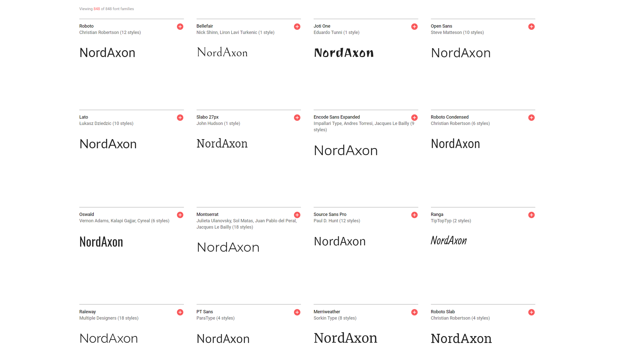
Here are my recommendations for her based on this list: I would pick Montserrat because it is has a circular "o", just like the circles in the logo. But I like Raleway as well. Lato might also work if you like a stronger feel. Roboto is used all over the place and is the font that Google uses for all it´s content. So, even if it is a good font I'd select another one.
Stylish fonts like Joti One and Ranga could be cool to use for a while, but unless you have a really good reason to use them, they might just end up taking too much focus from the logo ni the end. You can use them if you want to skip the logo and just go for a word mark. Serifs like Slabo 27px and Merriwearther give a feeling of news and stability and since we want to project energy and movement we might want to avoid letters with feet locked to the ground.
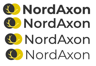
Now we need to figure out the thickness of the font to use. Too bold and we become a big rock and to light we might blow away by the wind. It should also be something that you can read from far away.
Back to the logo
Again I need to see how the logo behaves with different shapes and move things around a bit to get away from the MasterCard association. I tried with a triangle instead of one of the circles. Perhaps it could represent a mountain.

The I tried to tighten the logo a bit and move the horn down.

None of these did the trick, but I got the idea to move the circles a lot closer together and use the same color for the axon (horn) as the background circle. Since we would see less of the yellow circle I could also use a brighter yellow without it blinding the eye.
Since using one yellow the black and white version improved and the logo got a lot cleaner. I also added a light shadow to the axon making it pop slightly in front of the grey circle. Here is the final result:

- logo, design