Logo for health care centre
One year ago I was contacted by a start-up care centre that needed a logo and a graphical theme. They we actually starting two locations and wanted one logo for each and they were supposed to be on the same theme, to show that they are connected, but they should be differentiated enough so that you know that they are separate businesses. One of the centres had tulip in the name and should therefore be inspired by a tulip, if possible I might add a stethoscope, a heart a cross or an ECG. When it came to the colour, I got full freedom to pick colours that Swedish people would associate with health care. Because the customer did not have any sense of what colour would work.
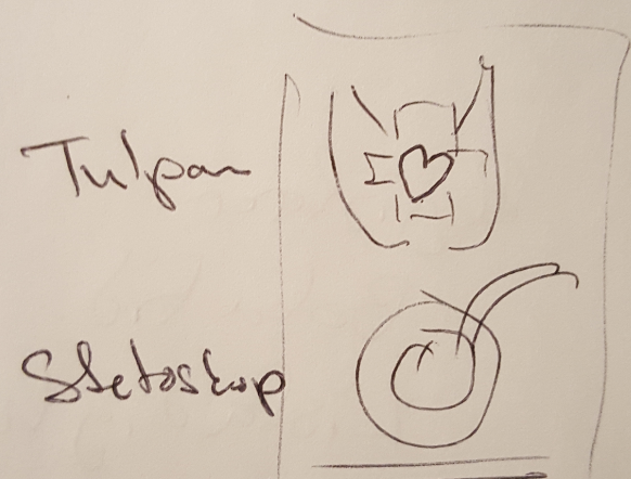
During the first meeting I got some ideas I wanted to try so I drew them quickly on a piece of paper just to get some initial feedback from the client, to know if I was in the right ballpark of what they wanted.

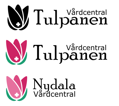
Now I had a crystal-clear image in my head that I wanted to do, so when I got home I started to create the logo. I know, you are supposed to do sketching on paper at first. But since the idea was so clear I just got to it.
But I needed two logos. So, I had to explore the stethoscope some more...
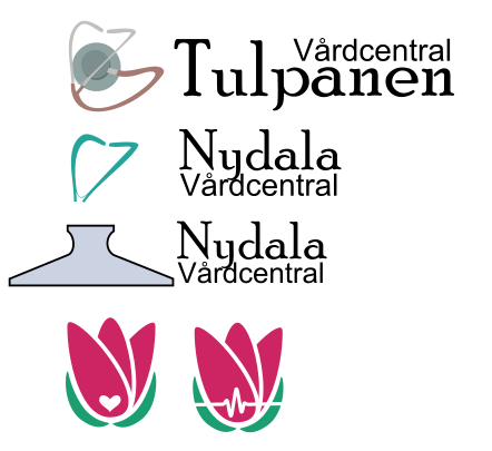
Either the stethoscope is really challenging to turn into a good logo or I should have spent some time sketching before moving on, but I decided to proceed with my first idea. I was not entirely sure about the font either, it was unique and drew attention but being a health care centre, cleanliness is more important. So I had to explore a more clean neutral font as well.
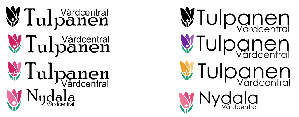
Now it dawned on me, this was a very stylized version of a tulip and perhaps people might not see it as a tulip at all. I had to look at images of real tulips to compare and see if I could adjust the design. I also got the feeling that the way I created the 3 pedals would feel more like the pages in a colouring sample. Somehow it I got doubts about the uniqueness of the logo. So I experimented some with the form.

Now I found a form that more resembled a tulip and I was especially happier with the leaves. But I still only have one logo for and I needed two. To solve this, I did some explorations with different symbols in the logo and I also tried some different colours, but the result felt more like it was two different locations for the same business rather than two different businesses connected by the same owner. Another problem with the symbol inside the logo was that it became invisible if the logo got too small. So, it needed to be big, but the bigger the symbol got the more it removed the feeling of the tulip.
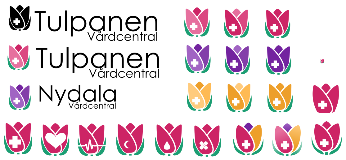
I now went back to the client to hear what they had to say about my initial ideas. And they were not unhappy about what they saw, but this time two partners joined in. And you know what happens when you get more people involved, you get more ideas on how the logo should look and what should be changed and how.
No problems, they liked the work so far. But they were not convinced, maybe if we added some hands instead of the leaves, that would hold the flower and they did not like the icon inside the flower. I needed to find another solution to differentiate the two logos. A heart would perhaps work better for the Nydala centre. As any good designer knows, everything looks better if it follows the golden ratio. So, I had so see how well my design followed the ratio and see if that would help improve it.
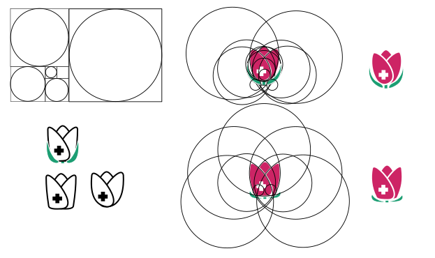
But the thing is that if you draw enough circles you can get any shape to fit within the circles of the golden ratio... Though this did make me do some minor adjustments they were actually happier with my first draft of the tulip, they just wanted me to add some hands there. So, I started playing around with the hear on the golden ratio instead.
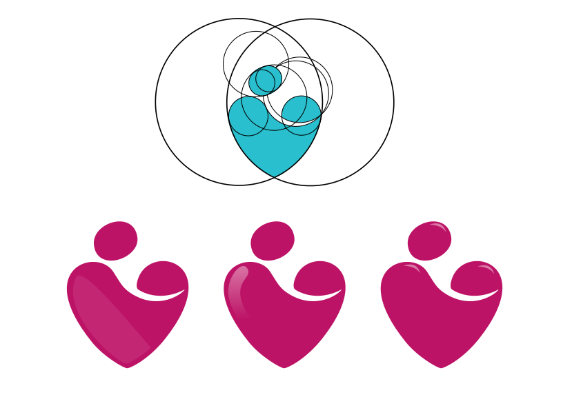
This was good, I got really excited, it's a heart. What can I say, I loved it! I could see the caretaker caring for the person lying in a bed or perhaps a woman holding a baby. I was sure this was it, I had two logos. But just to be sure I made some additional variations to show the client. That more or less covered all the aspects that they had asked for, just to be on the safe side. 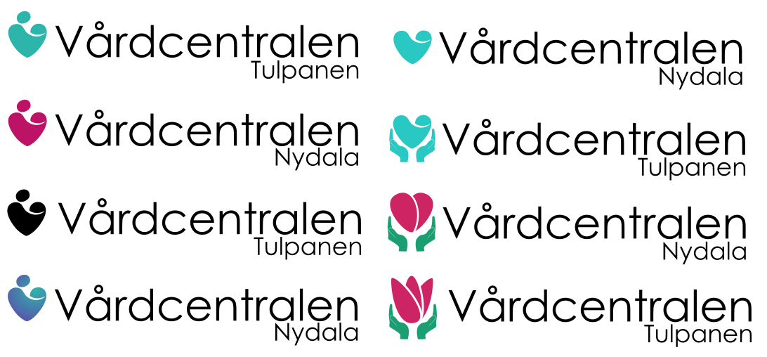
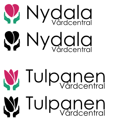
The client did not want to proceed with my heart, and my heart got broken... But the client liked the heart and the hands logo and the resemblance between the flower style heart and the tulip. And after a few minor iterations this was the final result.
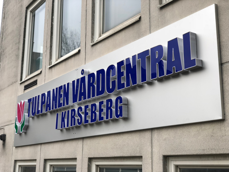
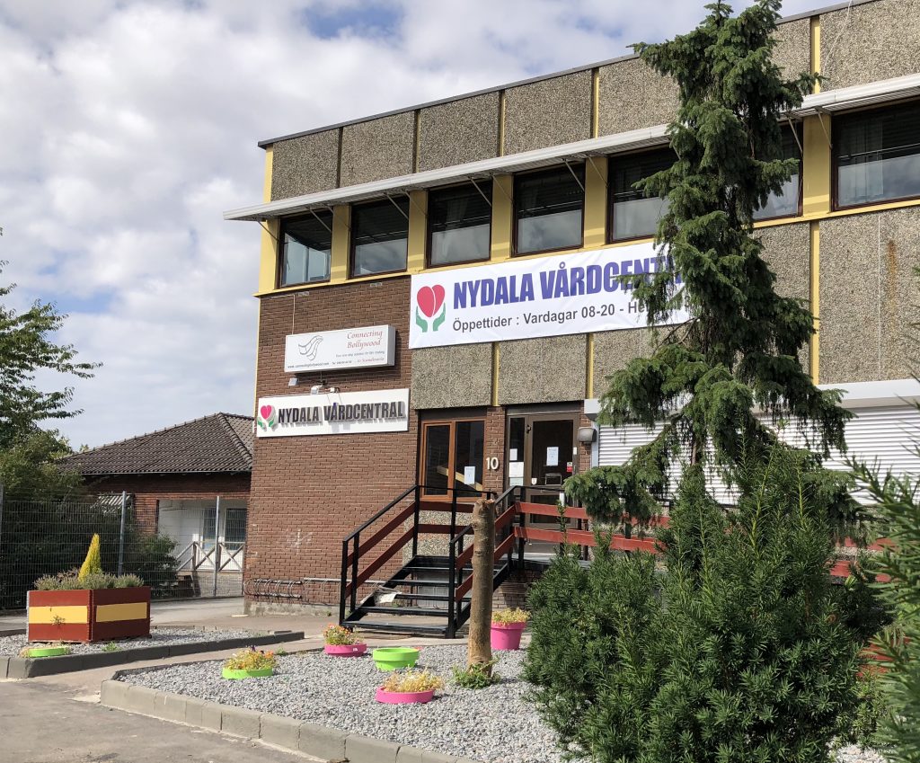
Today I did some follow up on their webpages and found photos of the logos on signage outside the buildings. And looking at your work materializing in the physical world gives a special feeling. I have created something that others like and are using. That is a great feeling to have. Even though the messed up the font and colour if the text on the signs, they have kept the original logo on their websites Tuplanen and Nydala care centre.
- Logo, Design, Health Care